Driving adoption for a new wealth management tool
Task
A/B test using Pendo to compare two versions of in-context guides on a wealth management tool. The results revealed one version achieved nearly double the engagement, potentially saving $X00,000 annually in call support while enabling more data-driven content decisions for the product team.

The rollout of a wealth management tool was a significant initiative for the client. The product team wanted to ensure that new users could adopt the product effortlessly. They aimed to integrate tutorials and in-context guides throughout the content to assist users, but they wanted to avoid creating too much clutter or adding to the cognitive load. Since traditional call support was expensive, the Pendo Center of Excellence(COE) team and I collaborated with the product team to update the existing guides, making the product more user-friendly while reducing support call volume.
The visuals on this page were tweaked due to confidentiality.
Our mission was to find the most user-friendly way to present these educational resources. We had a few key questions in mind:
- Were existing text links guides being used effectively?
- Which option best balanced discovery and cognitive load?
- Which format would boost engagement?

The setup required collaboration between our team and other product and UX teams. We segmented the right users using insights from participatory science and some creative experimentation with Pendo, as there wasn’t an off-the-shelf solution for testing multiple resources.
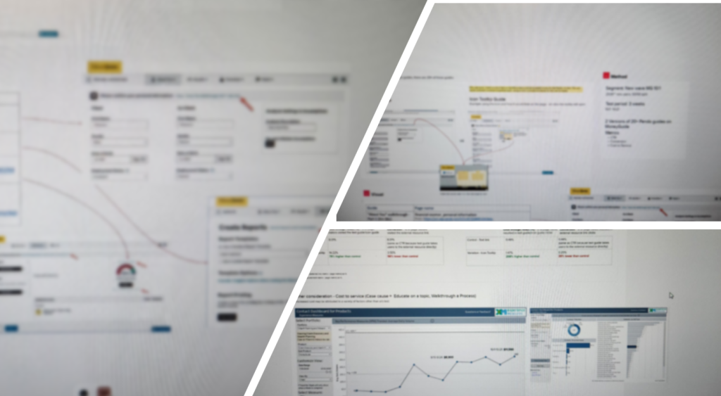
Using Pendo’s in-context guides, we conducted an A/B test across over 20 educational resources with about 2,500 new users. Divided into two groups over a three-week period, we analyzed the top five key resources to compare results.
The analysis revealed some interesting patterns. Icons initially drew more attention, but text links led to higher engagement levels. This suggested that while icons might attract users, text links provide clearer information about the content, resulting in deeper interaction. Given that our educational resources were part of a cost that adds up to over $x00,000/ annually, optimizing their effectiveness directly impacts the bottom line.
The potential cost savings of keeping the text link outweigh the benefits of switching to icon-only resources. However, considering the number of resources being added and the recent launch of the wealth management platform, we collectively decided to take a balanced approach, using a mix of text and icon resources where appropriate.
Research Impacts
Setting a Precedent with Innovative Testing Approach: This project was the first to use Pendo for extensive A/B testing, overcoming technology constraints. The approach enhanced our research and set a new standard for future projects, demonstrating an advanced methodology in UX research and the use of Pendo.
Strategic Impact
The success of this testing strategy has paved the way for new collaborations and use cases between product teams, UX, and the Pendo COE, promoting data-driven, evidence-based design and decision-making processes.
Product and Financial Impacts
The insights from the A/B test revealed valuable information on how design could impact the bottom line, directly influencing the product’s success and operational costs.
- 🤝Collaborative Approach: While operational costs alone might seem sufficient to make a decision, it’s essential to consider the overall impact by inviting stakeholders for feedback. This approach is crucial for gaining broader support and fostering creative solutions.
- 💰Effective Solution: You will always capture attention and develop effective recommendations when you tie your results to numbers and the bottom line.
- 🤯Embracing Experimentation: Initially, this project seemed like it wouldn’t be worth the time to engineer the testing. However, I was pleasantly surprised by how much the team and I learned from using Pendo, collaborating, and analyzing the results. These insights led to valuable follow-up conversations.